Renee Who?
Page 203

Renee Who?
Original Release Date: May 3, 2011
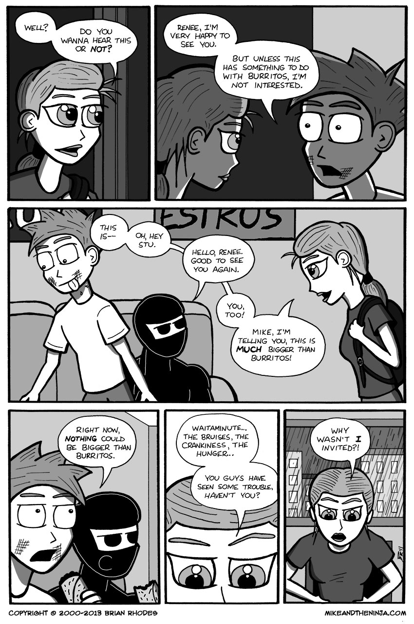
There are some subtly good lighting effects at work in the first two panels. In the first panel, Renee is hit by the light coming from Mike's apartment. Panel two is a 2-shot of Renee and Mike, and the front of Renee's face is highlighted by the same light hitting her in panel one, while Mike's face basks in the shadow from the corridor outside of his apartment. Renee's face could stand to have a little more light on it to keep the two panels more consistent, but the continuity is there and makes the exchange look good!
I also like the flow of the conversation in panel three. It feels like something natural that would happen if one person is talking to another person as they walk into another room, then notices somebody else is already in the room, and briefly interrupts the ongoing conversation to extend a greeting. I've done it before, and perhaps you have, as well.
You'll of course notice that Stu is eating in panel four without taking his mask off. Superb ninja technique!
Also, I forgot to draw the window behind Renee in panel five? Or maybe I left the background white for emphasis? It looks weird.

