Stu Versus San Francisco, Part 15
Page 80

Stu Versus San Francisco, Part 15
Original Release Date: September 30, 2008
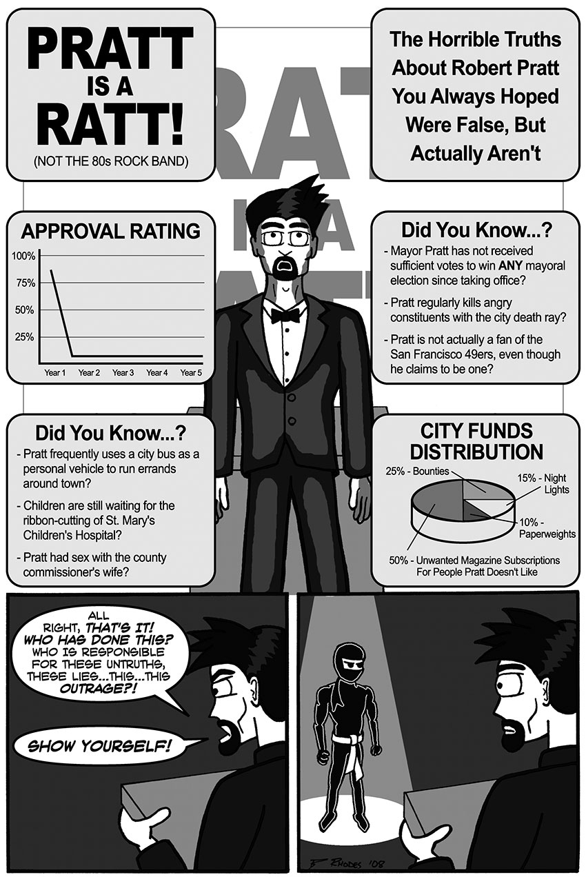
I remember having some trouble putting together a decent layout for this page. Originally, each PowerPoint slide was going to be its own panel, but I felt that would be incredibly boring, so I put together this thing where the slides kind of surround a stunned Robert Pratt. I think it gives the sequence a little more personality and makes it feel like it's more of a part of the event, rather than stringing together six detached panels full of text.
The last two panels, particularly Stu's reveal, did not quite turn out as dynamically as I envisioned them. Again, an audience probably would have made it more interesting. Also, I think Stu is a little too close to the stage. Ideally, Stu should be standing at the back of a big audience, with everybody turning to look at him and gasping when the spotlight hits him. That would have been killer. This is just all right. Another mediocre shortcut, another lesson learned.

